


Designed to Belong: TSHEPO V&A Waterfront
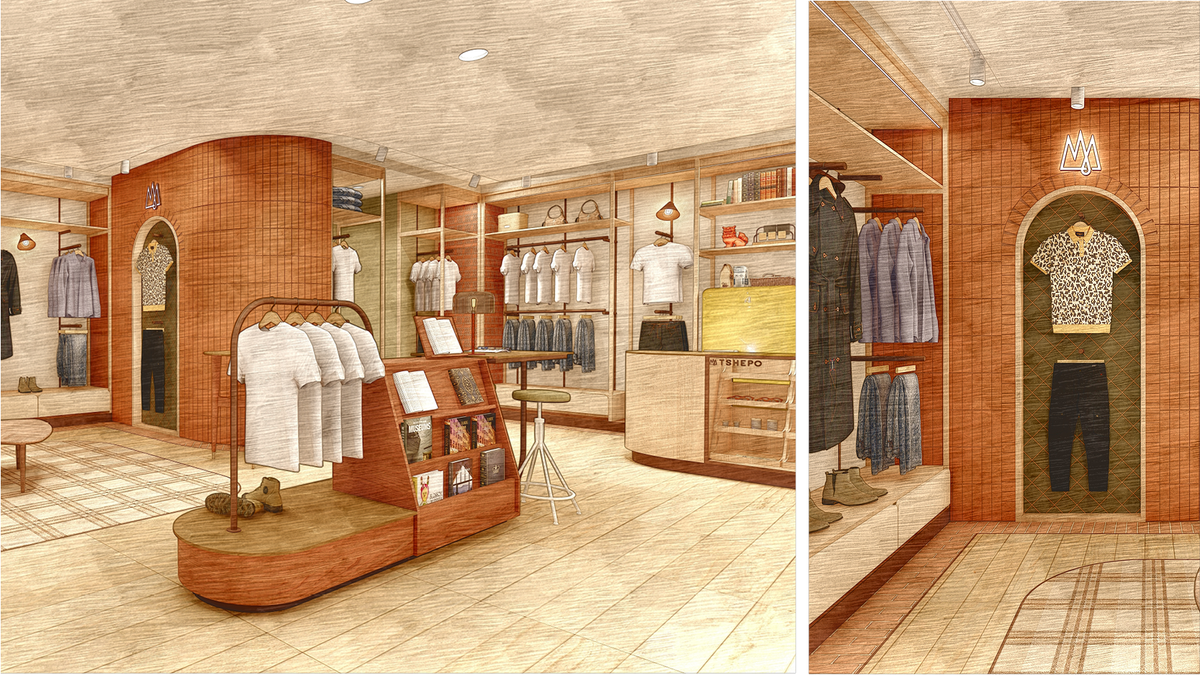
Urban Flux translates TSHEPO’s approach to making into a retail interior shaped by domestic spatial planning, material honesty, bespoke joinery and South African memory.
Before a store can look like TSHEPO, it has to behave like TSHEPO.
Our garments are made around a set of enduring truths. Care begins with construction. Materials should feel honest. Detail should have purpose. And the person wearing the piece should always remain at the centre. When we began shaping our V&A Waterfront store, the challenge was not to reproduce the visual language of the clothing at architectural scale. It was to translate those truths into space.
Working with Urban Flux, they developed a series of design codes that informed the plan, the material palette, the joinery, the lighting and even the way a customer crosses the threshold.

Belonging became a spatial plan
The first truth was belonging. TSHEPO has always been built around people, conversation and a sense of home, so the store could not feel like a pristine showroom arranged for observation. Urban Flux approached it as a lived-in interior: composed, but never staged.
That intention is established at the shopfront. The entrance is generous yet recessed, creating a moment of compression between the mall and the interior. Existing mall tiles continue across the threshold to draw visitors in, before the material language shifts and the atmosphere softens. A Dumelang welcome mat, framed in green mosaic, makes the gesture explicit without becoming theatrical.
Inside, the plan rejects the idea of a single open retail floor. Although modest in footprint, the store unfolds as a sequence of subtly defined rooms. This domestic spatial choreography creates changing sightlines, moments of pause and a more intuitive pace of discovery. Customers are invited to browse, sit and converse rather than move through a prescribed sales circuit.
Craftsmanship became the way materials meet
In a garment, quality often reveals itself where one element meets another: at the seam, the hem, the pocket and the finish. The architectural equivalent is the junction.
Throughout the store, craftsmanship is expressed through tectonic clarity and precise detailing. Brick floor tiles are resolved against timber with a fine bronze trim. Oak, terracotta and bronze move from floor to wall through carefully considered transitions. A brick wall turns through a softened curve before becoming a recessed display niche. Around the perimeter, a stepped ceiling conceals lighting while establishing a clear datum above the merchandise.
These details are quiet, but they are not incidental. They give the interior coherence and reveal the same discipline found in a well-constructed garment. Every permanent element, from the integrated rails to the folding display tables and oak cabinetry, was designed specifically for the store, allowing the architecture and its fixtures to read as one continuous system.

Authenticity became material honesty
The palette was selected not for novelty, but for how it would perform, weather and develop patina over time. Oak, terracotta, bronze powder-coated steel, fluted glass, rosewood and leathered dark stone bring grain, weight and tactility into the interior. Their surfaces are allowed to remain legible rather than being disguised beneath decorative finishes.
Like a well-made pair of jeans, the architecture is intended to mature rather than date. Terracotta introduces warmth and permanence. Oak flooring and bespoke joinery bring a domestic register to the robust shell. Bronze-toned steel provides a precise counterpoint, while fluted glass filters light and creates privacy without closing the space off. The leathered stone adds depth at the points where people touch and gather.
Materiality is not used as decoration here. It is the store’s primary narrative device, giving physical expression to TSHEPO’s belief that care should be felt in the object itself.
Johannesburg became a memory, not a replica
The V&A Waterfront store had to belong to Cape Town without losing the Johannesburg character that shaped TSHEPO. The answer was not to recreate Victoria Yards, but to abstract its industrial vernacular into a more refined retail language.
A red corrugated canopy frames the shopfront. Grass-block pavers are reinterpreted with green mosaic inserts that recall the planted walkways of Victoria Yards. A green pendant light has travelled from the brand’s Johannesburg home, while deep blue fitting-room doors with bronze numbering carry another subtle memory of place. Fine stripes of red, blue and yellow, drawn from the TSHEPO flag, edge the glazing and threshold.
These references are recognisably South African, but never literal. Familiar materials such as brick, corrugated sheeting and grass blocks are edited through proportion, finish and craft. In this way, the store speaks to its local context while holding its own within the V&A Waterfront’s international retail environment.
Quiet confidence became visual hierarchy
TSHEPO clothing remains the protagonist of the space. The architecture establishes an atmosphere, but it does not compete for attention.
The joinery was conceived as an extension of the interior rather than a collection of freestanding retail fixtures. Rails, shelves, platforms and folding tables share a consistent language of proportion, alignment and finish. Their flexibility allows different product categories to be displayed within one coherent system, while leaving enough negative space for each garment to breathe.
Colour follows the same hierarchy. Warm natural tones form the base, with green, yellow, red and blue appearing as controlled accents in the mosaics, fitting rooms, wallpaper and threshold details. Lighting is soft, warm and evenly calibrated. Concealed strips and accent wall lights add depth, while functional illumination renders the denim and its washes accurately. The effect is intimate rather than theatrical.
Story became objects with a second life
The interior gains much of its character from objects that carry memory. A salvaged vintage refrigerator has been restored, painted yellow and repurposed as a cabinet. An old tube television has been retrofitted with a digital screen. The point-of-sale takes the form of a traditional haberdashery cabinet, while a custom rosewood unit, informed by a vintage vinyl record cabinet, creates a central place to gather and engage with the collection.
This strategy of adaptive reuse gives familiar objects a new programme without erasing their history. Framed original jeans, photographs from TSHEPO’s early years, printed fabric banners and custom wallpaper bring the brand archive into the spatial experience. Together, these elements make the interior feel accumulated rather than installed, as though it has been shaped over time by the people and stories behind the brand.
Care became welcome
A brand space is not simply a logo made large. It is a value made tangible. At the V&A Waterfront, TSHEPO’s values are carried through the generosity of the threshold, the domestic rhythm of the plan, the honesty of the materials and the precision of details that may never consciously announce themselves.
Urban Flux’s design was realised through the collaborative work of craftspeople, fabricators and trades, each contributing to the final character of the store. That collective act of making is central to the experience. The interior feels human because it bears evidence of many hands.
The aim was never to create a space that impresses from a distance. It was to make one that welcomes people in. As Urban Flux puts it, success is measured by whether visitors feel “welcomed rather than sold to, connected rather than impressed.”
That is the final design code: Come On In.


Leave a comment
This site is protected by hCaptcha and the hCaptcha Privacy Policy and Terms of Service apply.